


When shopping center REDI opened its doors people were suspicious if it would become just another mall amongst others.
Shopping centres in Helsinki looked similar with colourfully bright and artificially fun appearance. Also the competition was fierce so REDI needed to stand out.
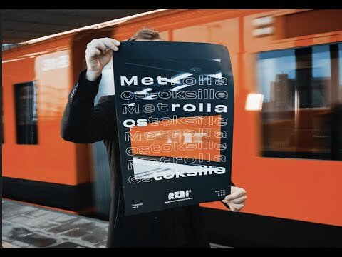
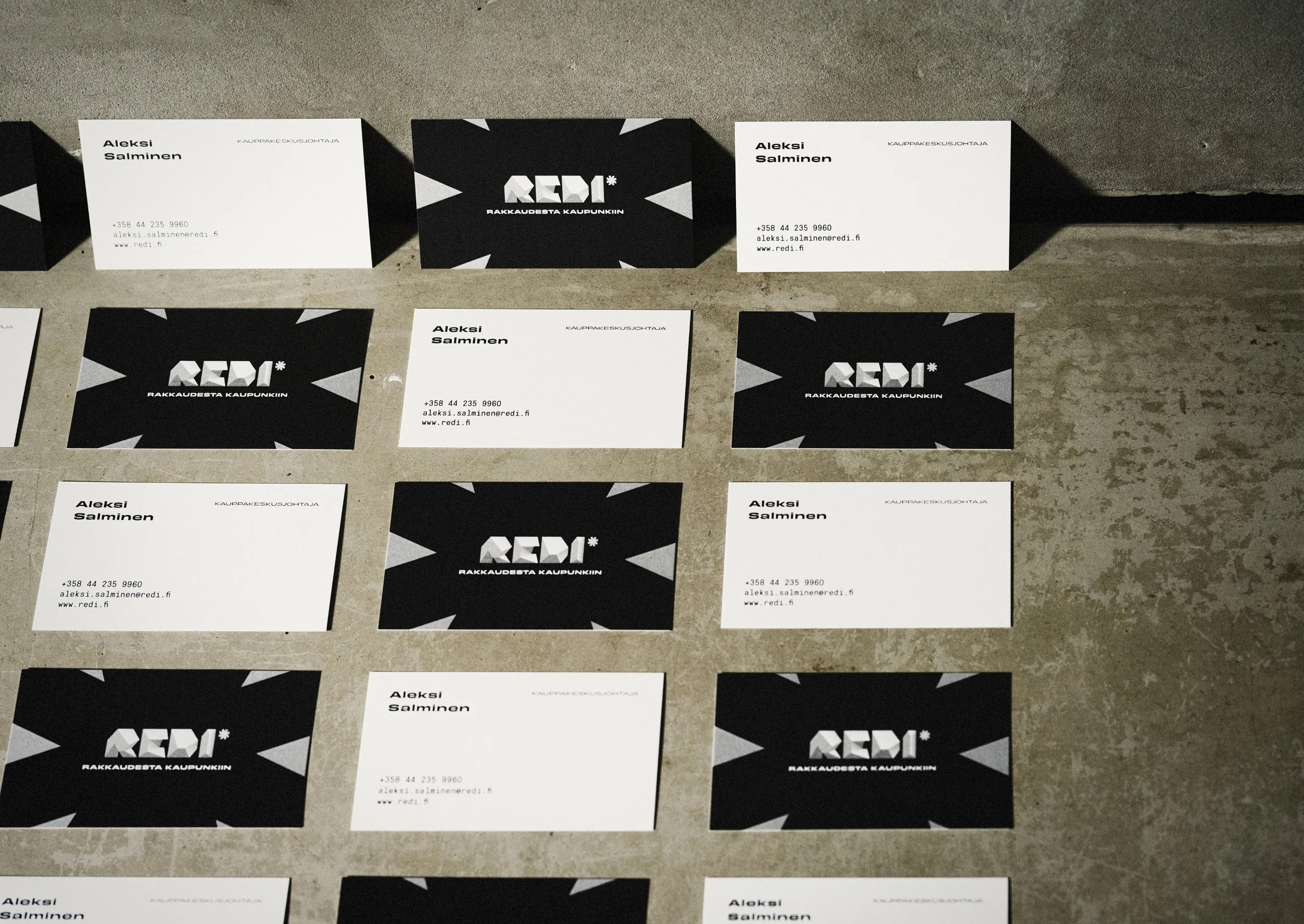
REDI is part of the ruggedly handsome and bubbly part of town Kalasatama. Actually it is a neighbourhood itself. We utilized this urbanity and roughness to create differentiating visual identity that is true to the brand.
The identity was crafted with strong typeface Obviously and complemented with GT Pressura Pro Mono. Brand colors were inspired by the urban scenery, graphic shapes by the architecture and conceptual images communicated the ambience of Kalasatama.
This helped REDI to stand out from the cliché world of malls and branded it a lively city district that has something going on all the time.